Ex Data, Scientia
Home
Contact
3D plots with rgl
Three-dimensional (3D) plots have a bad standing in scientific literature due to the difficulty of their interpretation, but can be useful to visualize complex relationships in an educational context. Here, we look at creating 3D surface plots in R.
Creating 3D surface plots is not a very straightforward task, neither in R nor in Python. For example, there exists currently no official tool in the easy-to-use ggplot library for creating 3D plots in a fast and intuitive manner. Therefore, we need to make use of the functions of the rgl package, which requires some more extensive coding.
library('rgl')
library('viridis')
library('fields')
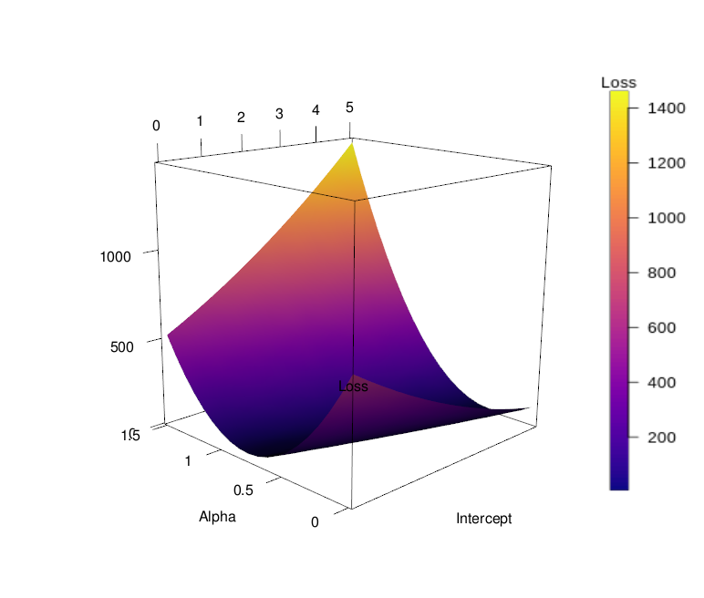
We will look at the plotting of a loss surface of a simple linear model, where the range of slope- and intercept parameter values span the loss surface, with the loss being the sum of squared errors between observations and predictions. We make use of the anscombe dataset available in R, more specifically of the variables x1 and y1, to fit a linear model of the following form:
lm(anscombe$y1 ~ anscombe$x1)
This equals the formulation "y1 = b + a * x1 + e" (where "e" is the residual error). By varying the values of "b" and "a", in a pre-specified range and insering these values into the equation, we obtain a loss value for every value pair. Thus, we obtain a full matrix of sums of squared errors:
in_1 = seq(0, 5, length.out = 20)
in_2 = seq(0, 1.5, length.out = 20)

rsq_mat = matrix(nrow = 20, ncol = 20)

for(i in 1:20){
  rsq_mat[i,] = sapply(seq(1, 20, 1), function(x){
    sum((anscombe$y1 - (in_1[i] + anscombe$x1 * in_2[i]))**2)
  })
}
We have varied the intercept in the range zero to five (in_1), and the slope in the range zero to 1.5 (in_2) (picking 20 random values each), and calculated the sum of squared errors between observations and predictions for each combination. This yields a matrix of 20 x 20 loss values. While the vectors in_1 and in_2 will be our x- and y-coordinates in the surface plot, the matrix will give the values for the third dimension, the z axis, or the "topography" of the surface. For plotting three-dimensional surfaces, it is always necessary to have such a matrix, where the number of x values equals the number of rows in the z matrix, and the number of y values equals its number of columns. Missing values are not allowed. When generating "artifical" data, like here, this is not a problem. However, the plotting of actual measured data as surfaces can be problematic and can require interpolation to fill up the missing values.
We can also color the surface, e.g. by mapping a variable to a color scale. In the current example, we want to assign the same variable to the color scale that is also mapped to the z axis (and thus, represented by the topography of the surface): the sum of squared errors between model predictions and observations. We require a matrix with dimensions equaling those of the z matrix, to which we assign color codes. We thus define a color scale, which provides the range of color values available, and the empty matrix to be filled with color codes, which will be drawn from the color scale. Here, we use the "plasma" color scale, one of the four "viridis" color scales optimized for perceiving color gradients, and set a resolution of 100 shades, which will be sufficient for the amount of data to be plotted.
colscale = viridis(100, option = 'plasma')

cols_alpha = array(dim = dim(rsq_mat))
Now, we need to fill the empty matrix with color codes. The codes are contained in the color scale object just created, which is a list of 100 character strings, where each represents one shade. We obtain the index for right shade for each cell in the matrix by normalizing the squarred-error sums in the z matrix constructed in the previous step (i.e., we divide each sum by the maximum sum contained in the z matrix, such that the values range from zero to one). The normalized values are then multiplied with 100 (the number of color shades) and rounded up (using the "ceiling()" function) to obtain integer indices (values between one and 100). These indices are then used to subset the color map, and the corresponding color codes are filled into the cells of the color matrix. In the code shown below, these steps - normalizing the error sums, generating indices, subsetting the color matrix and assigning color codes to the color matrix - are performed for each cell of the matrix individually by using a nested loop (looping over all matrix columns and -rows).
for(u in 1:nrow(rsq_mat)){
  for(w in 1:ncol(rsq_mat)){
    try(cols_alpha[u,w] <- colscale[ceiling(rsq_mat[u,w] / max(rsq_mat) * 100)])
  }
}
Finally, having generated both the z matrix (or "topography matrix") and the color matrix, we can generate our surface 3D plot. Of the following lines of code, only a few are of interest; the others serve general technical functions that should not vary between different plotting tasks. In the bgplot3d line, a color bar is constructed to serve as a legend to the plot. Here, the legends.args argument should be modified by supplying the desired name for the legend; further, the range of values to be plotted should be given to the zlim argument, which is here set to the range (minimum and maximum values) of the sums of sqared errors, as contained in the z marix. Finally, the color map used to create the color matrix must be provided to the col argument. In the plot3d line, the two vectors containing the x- and y values (slopes and intercepts), as well as a vector of z values (sequence of values from minimum to maximum sum of squared errors of arbitrary length) must be provided to set up the framework for the 3D plot. Normally, this would yield a 3D scatter plot, but since we set the type argument to "n", nothing but the three axes gets plotted. In the surface3d line, the x- and y vectors must again be provided, as well as the z matrix and the color matrix (the latter to the col argument). Further, labels for the three axes can be provided. Note that the sequence of x- and y vectors matters; the length of the first vector should equal the number of rows of the z matrix, the length of the second vector should equal the matrice's number of columns.
open3d()
par3d(windowRect = c(100, 100, 612, 612))
parent = currentSubscene3d()
mfrow3d(1,1)
bgplot3d(suppressWarnings(image.plot(legend.only = TRUE, legend.args = list(text = 'Loss'), zlim = range(rsq_mat), col = colscale)))
next3d(reuse = FALSE)
plot3d(in_1, in_2, seq(min(rsq_mat), max(rsq_mat), length.out = 50), type = 'n')
surface3d(in_1, in_2, rsq_mat, col = cols_alpha, xlab = 'Intercept', ylab = 'Slope', zlab = 'Loss')
aspect3d(1,1,1)
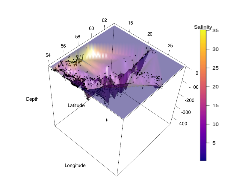
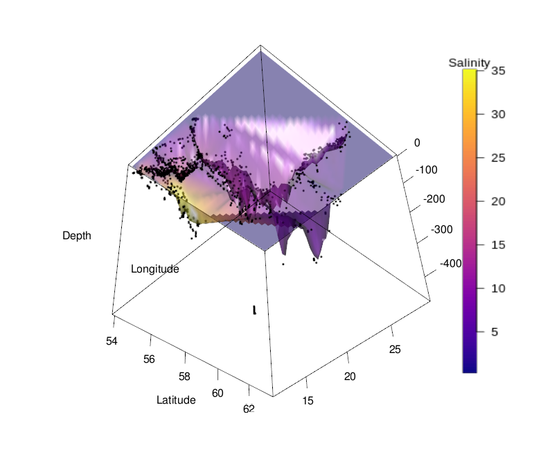
This concludes the procedure for generating a 3D surface plot from artificial data. As mentioned above, generating such a plot for actual measured data is often difficult, because there rarely exist observations for all combinations of input variables. See below a 3D surface plot of the depth profile of the Baltic Sea, with salinity represented by color, as an example. Plotting 3D surfaces is thus better suited for model data, where these visualizations can be quite effective for understanding of processes and concepts.